I just built an entire product in thirty-two days without writing a single line of code, and I'm blown away by the experience. I have to share this with you.
The Approach
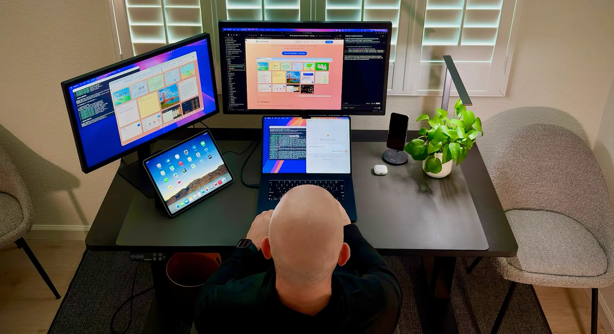
In my last post, I told the story of why I built Cute Desk App — a personal need for a browser start page with tons of cute and useful widgets — clock, weather, notes, AI chatbot, solitaire, and tons more — right there at my fingertips every time I open a new tab. In this post, I want to show you exactly how I built it all. Every milestone, every decision, day by day.
Here's the interesting part: I built the entire thing with an AI coding partner. I used Cursor, an AI-powered code editor, as my development environment and Anthropic's Claude 4.6 model. The AI wrote the code. I directed every decision by starting with an in-depth Product Requirement Document (PRD) for AI, which I also used AI to help me write — the product vision, the user experience, the visual design, and even the technical architecture was based on my years of experience developing digital products. This wasn't vibe coding — casually prompting an AI and shipping whatever it generates. This was deliberate, structured, and driven by a clear plan from day one. When something didn't look right, I said so. When something felt off, I pushed back. The AI was my collaborator, but the product is mine.
Thirty-two days. Twenty milestones. Here's what I learned — and below that, the full day-by-day timeline.
What I Learned
Since I was young and throughout my career, I've always felt like a craftsman in the digital world — someone who cares deeply about how things feel, how they look, how they work under the hood. Early in my career, I spent years writing thousands and thousands of lines of code, learning new frameworks, picking up new libraries, asking questions on Stack Overflow, and debugging at three in the morning. Over time, I built experience across product, design, and engineering — becoming what Tomer Cohen, former Chief Product Officer at LinkedIn, describes as a full-stack builder.
Building Cute Desk App made me realize that this craft — the art of typing each line of code, each semicolon by hand — may be reaching an inflection point. It's not gone entirely, but it's shifting fast. You still need deep knowledge and understanding to build great digital products. First, you need to be curious, to know what to ask for, how to evaluate what you get back, and when something is wrong. But the act of writing every line yourself? That part is changing before our eyes.
I was no longer just the product manager or the developer. Instead, I embodied what I've always felt like — a digital craftsman:
- The Architect — defining the vision, what to build, and why it mattered
- The Director — guiding the AI in each step, but just enough, knew when to trust, and let it do its thing; write thousands of lines of code
- The Validator — reviewing, pushing back, and approving
Some of the old rules start to feel different too. For example, as developers we're taught to modularize code — create reusable functions and modules — so it's easier for other developers to understand and manage. But if AI can navigate and manage a large codebase fluently, who is the modularization really for? I still did it — because someone might actually read all eight thousand lines of code (good luck with that), and because it was straightforward to refactor with AI — but it made me question assumptions I've held for years.
I also learned how important it is to write a Product Requirement Document (PRD) that makes sense when working with AI. As a product manager, a PRD is a familiar artifact — the blueprint of a digital product. But a PRD for an AI coding partner needs something extra: explicit guardrails that define what the AI should never do, because unlike a human team, it won't infer boundaries on its own. The AI is extraordinarily fast and capable — it can write a full solitaire game, implement AES encryption, or refactor an entire codebase into modules in a single session. But it doesn't have taste — what Nitin Nohria describes in The Atlantic as the instinct that tells you not just what can be done, but what should be done. For example, the clock widget shows an image of the San Francisco Bay in the background — it doesn't understand that if you're looking at the Bay from south to north, the sun moves from right to left — east to west. It doesn't know that if you stop watering the plant widget, the plant should start dying. A detailed PRD gives the AI the intent it can't generate on its own.
A well-written PRD also helps the AI plan its approach — and Cursor's agent system can break complex tasks into parallel steps, spinning up sub-agents to work on different parts simultaneously, which made the whole process remarkably efficient — and even create, update, and delete files and run bash commands in the terminal to do commits and push to GitHub. Beyond that, I kept several Cursor Rules — MDC files (markdown for Cursor) with patterns used, decisions made, gotchas encountered, and even future plans — so the AI always had enough context to do a great job. The better the context, the better the output. Every time.
Every one of those decisions was mine. The AI was my hands, typing line after line of code, and my eyes, scanning through thousands of lines without fatigue. But I was the craftsman — the one who understood the needs, defined the intent, and brought the taste. I described what I wanted, reviewed what it built, pushed back when something wasn't right, and iterated until it matched the experience I had in my head. That back-and-forth — that's where the product gets made.
Building digital products by hand was always time-consuming and expensive — even for someone who loves every part of it. Now everything has changed. With AI as a partner, a full-stack builder can take a product from vision to launch — end-to-end, quickly, with consistency in quality, at a fraction of the cost. This feels like a new chapter in my creativity. The tools have finally caught up to the ambition.
Thirty-two days, twenty milestones, fifteen widgets, and a product I'm genuinely proud of. If you haven't tried it yet, open Cute Desk App and make your start page yours.
And if you're enjoying it, consider leaving a tip. It means a lot and goes directly toward making the app even better.
The Timeline
1. The Foundation — January 25
It all started on a Sunday evening. I'd been wanting a better start page for months, and I finally sat down to build one. But before writing a single line of code, I established the core principles that would guide every technical and design decision going forward — these were part of my PRD and they were non-negotiable. The app had to be completely private: all data stored locally in the browser, nothing transmitted to a server, ever. It had to be lightning fast: no heavy frameworks, no build step, just vanilla HTML, CSS, and JavaScript that loads instantly. It had to be free, and it had to work without an account.
These principles shaped the entire technical architecture — localStorage instead of a database, client-side-only logic, no external dependencies — and every feature that came after had to honor them. The first commit had a clock with a sun and moon arc that tracks the actual position of the sun throughout the day. The background of the clock is the San Francisco Bay Area seen from south to north, so the sun and moon needed to travel from right to left — east to west — to make geographic sense. The best part is the night sky, with its surprise shooting star if you hover at the right moment.
Alongside the clock: a notes widget, a to-do list with drag-and-drop reordering, a calculator styled like a paper-tape machine, a links widget for my most-visited sites, and a search box that focuses automatically so you can start typing the moment a new tab opens. I told the AI what I wanted, described how each widget should behave, and iterated on the details until everything felt polished.
2. Weather Widget — January 25
The weather was one of the very first things I wanted on my start page. The widget uses the Open-Meteo API — free, no API key required, no rate limits for reasonable usage. It detects your location via the browser's geolocation API, or you can search for a city with autocomplete. It shows current conditions, high and low temperatures, and sunrise and sunset times. The data refreshes every thirty minutes and only when the widget is visible, so it's not wasting API calls in the background. I chose Open-Meteo specifically because it requires no API key — which means no privacy trade-off for the user.
3. AI Chatbot with Encryption — January 25–27
I wanted a quick way to ask an AI a question without leaving my start page. But offering a chatbot the traditional way would have meant charging a subscription to cover the API costs — and the app needed to be free. That was non-negotiable. So I went a different route: you bring your own OpenAI Platform API key. You pick the model, start conversations, and see responses rendered with markdown.
I know that for the average user this might feel complex to set up, but I wanted to offer the option rather than not offer it at all. The part I cared most about was security. Your API key is encrypted with AES before it's stored in the browser. You set a password to lock it, and you enter that password to unlock it each session. The AI implemented the encryption; I insisted on the locked-by-default approach because storing an API key in plain text in localStorage didn't sit right with me. Privacy is a principle, not a feature.
In the future, I plan to experiment with Web LLMs that run entirely in the browser — no API key, no server, completely local. The technology is getting there.
4. Photo Widget — January 27
I wanted to see pictures of my family right there on my start page. Not buried in a cloud album — right in front of me, every time I opened a tab. The photo widget supports drag-and-drop from your desktop or from the web, file picker upload, and navigation between multiple images. All images are stored locally in the browser as base64 data. No server, no account, completely private. The AI built the file handling; I made sure the drag-and-drop felt natural and that the images scaled properly within the widget frame.
5. Quotes Widget with Author Portraits — January 27 – February 1
I wanted to start every day with a good thought. The quotes widget shows one quote per day from a curated collection of 486 quotes. The selection is deterministic — same quote all day, different quote each day, no server needed, works offline, consistent across tabs. I hand-picked the quotes and the authors.
I wanted to pair each quote with a portrait of its author, so I selected the most well-known figures and worked with ChatGPT to generate pencil-drawn portraits of each one. ChatGPT helped me navigate what was possible without infringing on personality rights or likeness restrictions — which authors were in the public domain, which required more care, and how a stylized pencil illustration could be used respectfully. I made sure Carl Sagan was prominently featured; he was my hero growing up, and his show Cosmos shaped how I see the world. In total, fifty-one portraits.
The font size adjusts dynamically based on quote length so short quotes feel impactful and long quotes remain readable. I kept refining the thresholds until the typography felt right at every size. The portraits and the quote cache preload on page load so there's never a delay when browsing between quotes.
6. Dynamic Widget Management — January 25–27
The early version had a fixed set of widgets in a fixed layout. That wasn't good enough. I wanted every user to arrange their start page the way that makes sense to them. Over a few days, I directed the AI to build a full widget management system: show and hide any widget, drag to reposition, resize with handles, per-widget color themes from a curated palette, minimize and restore, z-index stacking on focus, and a dock at the bottom for quick access. Every widget remembers its position and state across sessions. This was the moment the app stopped being a dashboard and became a customizable desk.
7. From Local File to Firebase Hosting — January 28
Up until this point, Cute Desk App was literally a file on my hard drive. I'd open it in my browser, and that was it — no server, no hosting, no domain name. But the more I built, the more I realized other people might want the same thing. So I made the decision to host it publicly on Firebase Hosting.
I chose Firebase because it has a generous free tier called Spark, but I'll be honest — I was concerned. The Spark plan has bandwidth and storage limits, and if the app ever gets popular, I could hit those limits fast. That concern became a design constraint: I needed to keep everything as light as possible. Every image optimized, every font subsetted, no unnecessary dependencies, no heavy frameworks. The core principles of speed and simplicity weren't just about user experience anymore — they were about keeping the app viable on a free hosting plan. That tension between ambition and constraint shaped a lot of the technical decisions that followed.
8. Google Analytics with Cookie Consent — January 28–30
Now that the app was live and real people could use it, I needed to understand how they were using it. But I also believe in privacy — that's a core principle. So Google Analytics only loads after the user explicitly accepts the cookie consent banner — not before, not silently in the background. On the marketing pages, analytics load directly since those are public web pages, but the app itself is consent-gated. I directed the AI to implement event tracking for widget usage, menu interactions, and tip clicks, all with a page parameter so I can see what happens where. The analytics tell me which widgets people love, which they ignore, and where they get stuck.
9. Tip Jar — January 29
Cute Desk App is free, and I wanted to keep it that way. But building and maintaining it has real costs — the AI coding partner I use to develop the app runs on token-based pricing, and every conversation, every feature, every iteration costs money. On top of that, if the app grows beyond what Firebase's free Spark plan can handle, I'd need to upgrade to the Blaze plan (pay as you go), which means hosting costs too. So I added a tip jar powered by Stripe.
The important thing to me was not being annoying about it. The tip modal only appears after you've been using the app for at least seven days, it waits for your first click plus a four-second delay so it doesn't interrupt you mid-thought, and it only shows once per session. You can snooze it for a week, dismiss it permanently, or leave a tip. I designed every detail of that logic — the AI implemented it, but the trigger conditions and the respectful timing were my decisions. Every tip goes directly toward keeping the app free and improving it. If you'd like to help, you can leave a tip now.
10. Service Worker and Offline Support — January 30
A start page that doesn't work without internet isn't a start page — it's a website. I wanted Cute Desk App to load instantly every single time, even on a plane, even when Wi-Fi drops. The service worker uses a cache-first strategy for all local assets and network-first for update detection. After the first load, the entire app works offline. I directed the cache versioning strategy so that returning users always get fresh assets after a deploy, and I made sure the precache list includes every widget module so nothing is left behind.
11. Cross-Tab State Sync — January 31
Cute Desk App is designed to be your permanent start page, which means you might have it open in multiple tabs or windows. If you check off a to-do in one tab, it needs to update everywhere else instantly. I directed the AI to implement a localStorage storage event listener that detects changes from other tabs and re-renders the affected widgets. It's invisible infrastructure — you never think about it, but you'd absolutely notice if it wasn't there.
12. Cross-Platform Fixes — January 31
I develop on a Mac, but I know my users are on Windows, Chrome, Firefox, Safari, Edge. When I tested the app on Windows, I noticed the drag cursor looked pixelated and some icons were slightly misaligned in Chrome. These are the kinds of things most people wouldn't notice consciously, but they'd feel. I had the AI add OS and browser detection that applies CSS classes to the body — os-windows, browser-chrome — so I could write targeted fixes. Polished means polished everywhere, not just on the machine you built it on.
13. Plant Widget — February 6
This is the widget that makes people smile. It's a virtual plant that lives on your start page. Water it every day and it grows through twelve stages — from a tiny seedling to a fully bloomed plant. Forget to water it, and it starts dying through six stages of wilting. There's something oddly satisfying about checking in on your little plant each morning.
For the artwork, I tried using AI image generators to create the growth and dying stages, but I couldn't get them to produce consistent results across all eighteen images — the style kept shifting between stages. So I hired a graphic artist to hand-draw every single one. Sometimes the human touch is what it takes.
I asked the AI to add a night mode that darkens the plant with a blue tint based on the same sunrise and sunset data the clock uses, so the whole desk feels connected. The watering can button stays unaffected by the night filter — a small detail I insisted on because it felt right. In the future, I'd love to have each growth stage generated uniquely for every user — so your plant looks different from everyone else's. With more tips, that dream gets closer.
14. Onboarding Experience — February 7
First impressions matter. I designed a three-phase animated welcome flow that introduces new users to the app. Phase one: a large app icon fades in with the title — clean and warm. Phase two: a personalized tagline appears ("Your Chrome start page with tons of cute and useful widgets") with the browser name detected automatically, and eight widget icons appear one at a time. Phase three: benefit bullets animate in with staggered timing, and a "Start" button lets the user begin.
I choreographed every animation timing, every transition, every delay. The AI built the state machine; I directed the choreography until it felt smooth and delightful, not busy.
A Note About Costs
Around this point in the project, Cursor sent me a friendly notification: I'd hit my Team Spending Limit. I had to bump it up — and then bump it up again several days later. Turns out, building an entire product with an AI coding partner burns through tokens faster than you'd expect. I started paying closer attention to my usage dashboard — premium requests, fast requests, billing cycles, the whole thing. I even tried switching to less expensive models to bring costs down, but nothing gave me the same quality as Anthropic Opus 4.6. I just couldn't switch. I'd built so much trust in the output that downgrading felt like hiring a different general contractor halfway through building a house.
At this midway point, the token cost came to about $600 USD — and the full cost of building Cute Desk App, including everything, was around $1,200 USD. I don't mind it one bit. Every penny went toward building something I'm genuinely proud of, and that's a price I'd pay again without hesitation.
I did some research, learned how to be smarter with prompts, and managed to slow the burn rate. If you'd like to help offset those costs, you can always leave a tip.
15. Solitaire Widget — February 12
Not everything has to be about productivity. Sometimes you need a two-minute break, and a quick game of solitaire is perfect for that. Every time I video-call my older brother, he's playing solitaire on his computer — it's just one of those timeless games. I wanted to capture that classic Windows solitaire feeling right on the start page.
I designed all fifty-two cards myself in Sketch, an app I love for this kind of detailed work. The cards needed to be legible inside a small widget, which meant I couldn't just shrink a standard deck — I had to rethink the proportions, the pip sizes, and the face card layouts for a tiny canvas. I spent time researching classic playing card design to get the details right, and I tracked down a proper playing card typeface to give the ranks and suits that authentic feel.
Then I asked the AI to build a full Klondike solitaire implementation — proper card stacking rules, undo support, auto-complete when the game is won, and responsive card scaling that adjusts to the widget size. Getting the card layout to look right at different sizes took several iterations. I kept pushing back on the scaling until the cards felt proportional and the game was genuinely playable, not just a tech demo.
16. Meeting Planner Widget — February 23
This was one of the most important widgets for me. I work with people from all over the world, and knowing when it's a good time to meet isn't a nice-to-have — it's a necessity. I was tired of switching between time zone converter websites every time I needed to schedule a call. So I built a widget where you add cities, see their working hours side by side, drag to adjust the time, and immediately spot the overlap. When you find a good slot, you copy the schedule and paste it into an email. The AI handled the timezone math and the visual time-of-day bands; I designed the interaction model and made sure the UX was intuitive enough that you didn't need instructions.
17. Widget Modularization — February 24
For weeks, all fifteen widgets lived in a single JavaScript file. That was fine when I was the only one working on it, but the file had grown to over five thousand lines and I knew the architecture needed to evolve. I directed a full modularization — every widget extracted into its own ES module file under js/widgets/, loaded dynamically with import(). Visible widgets get preloaded in the HTML head. Hidden widgets are preloaded during idle time so toggling them on feels instant. Every widget gets a loading skeleton while its module loads.
This was a huge undertaking — touching every widget in a live app is risky, and one wrong move could break everything. The AI and I had a real discussion about the risk and the best approach. Together we agreed on a strategy: extract one widget first, test it thoroughly, and only then move on to the rest in blocks. The AI created a detailed six-phase plan, which I reviewed and approved before we started. Then we moved forward step by step, phase by phase. It was nerve-racking, honestly — watching the entire codebase get restructured in a single session — but because we'd planned it carefully and tested at each phase, nothing broke.
I defined the module contract, the lifecycle hooks, and the public API that widgets use to talk to the core. No build step needed — it all runs natively in the browser.
18. Marketing Pages and SEO — February 24
A product nobody can find is a product nobody uses. SEO was top of mind. I spent a full day directing the creation of a complete marketing site alongside the app: a features overview page, fifteen individual widget detail pages (one for each widget), a how-to-use guide with browser-specific instructions, an about page, a blog, and a help form backed by Firebase Firestore to securely store communication with me. Every page has proper Open Graph tags, Twitter Cards, JSON-LD structured data, and a canonical URL.
The AI built the pages, but its first pass was full of colorful emojis that screamed "AI-generated" and clashed with the Cute Desk App aesthetic. In the app itself, we use UIcons from Flaticon — clean, consistent line icons that feel handcrafted, not auto-generated. I had the AI strip out every emoji and replace them with the same Flaticon icons used throughout the app. I designed the information architecture, wrote the copy direction, and made sure every page matched the warm, clean visual identity I'd established. This was the moment Cute Desk App stopped being a tool I built for myself and started being a real product with a public presence.
19. "Start Page" Terminology — February 26
This one might seem minor, but it matters for how people find and understand the product. I realized we'd been inconsistent — some places said "homepage," others said "start page," others said "startup page." I went through the entire app, the onboarding flow, every marketing page, every meta description, and standardized everything to "start page." The only exception is Safari's how-to-use instructions, where we keep "homepage" because that's literally what Safari's settings call it. Consistency like this is invisible when it's done right, but it builds trust. I asked the AI to do the sweep, reviewed every change, and made sure nothing was missed.
20. Mobile Redirect — February 26
Cute Desk App is a desktop experience. Widgets you can drag, resize, and arrange — that doesn't work on a phone. Early on, I'd added a modal that warned mobile users and let them "Continue Anyway," but honestly, continuing just led to a broken experience. That bothered me. Today I replaced it with something more honest: mobile users are now instantly redirected to a dedicated landing page that explains the app is built for desktop and laptop browsers, with links to browse all the marketing pages. No broken UI, no pretending.
I directed the AI to put the detection script in the HTML head so it fires before any CSS or JavaScript even loads — no flash of the desktop app. It's a small change, but it's the kind of thing I care about. Respect the user's time.

Aldo is a product leader with 10+ years of experience helping Fortune 500 companies, small businesses, and startups build and grow web, mobile, eCommerce, and AI integration in operations and digital products. He is the founder of Copotential, a San Francisco-based product consultancy.